

Advanced Mode User Guide
Widgets
Widgets are the building parts of your website. Each widget type has its own editor allowing you to configure its unique properties. In the next chapter we will see how different widgets can be configured.
-
Create and edit widgets
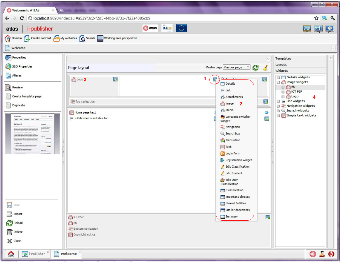
There are many ways to create and edit a widget. The main way of creating various widgets is from the page. Open the editor of the page you want to place the widget into. Select the region to contain the new widget and click on its “Widgets” button.
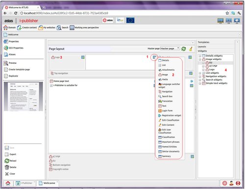
In the picture above you can see the page editor again. The “Widget” button (1) is circled. After clicking on that button, the list with all available widgets types pops up allowing you to select one and create new widget from the selected type. There are 23 different widgets you can create and place in your page. Each of them has different purpose:
The last four widgets display the results retrieved by the text analysis services
-
Details – display the details of a single content item;
-
List – display lists on content items;
-
Attachment – manually upload a list of various documents ready for download;
-
Image – upload single image;
-
Media – upload media file displayed in a player;
-
Language switcher – switch between the languages supported by a certain website;
-
Navigation – display either navigation or categorization tree;
-
Search box – provide search box for searching website's content;
-
Translation – translate some of the content of the current page by using the automatic translation service;
-
Text – display text (valid HTML);
-
Login Form – provide a log in for your site users;
-
Registration form – provide a registration for your site users;
-
Edit Classification – display a form for editing content item's classification;
-
Edit Content – display a form for editing specific content item;
-
Edit User Classification – for editing website users' classification trees;
-
Classification – displays how the selected content item is classified;
-
Import content - allows the user to import content items from an archieve;
-
Text mining statistics - provides details about the text mining actions, performed on a given content item;
-
Cluster - allows the users to group their content items based on text mining excerpts;
-
Important Phrases;
-
Named Entities;
-
Similar documents ;
-
Summary;
To place an image logo in your page, for instance, you have to create an image widget (2). Widgets can be reused in different pages. To reuse a widget open the “Widgets” store in the page editor and find the desired widget. Place it in the selected region by drag'n'drop. When you drop the widget you would be asked if you want to duplicate the widget instead. Thus, you can create a new widget from an existing one.
The easiest ways to edit an existing widget are either to open a page containing the widget and click on it(3) or to double-click on the widget in the widgets store (4) (regardless of the pages
All kinds of widgets have different purpose and, thus, different configurations. Nevertheless, there are some common for all widgets properties. They are presented in the first tab of every widget editor. These are the name of the widget (that can be translated), its description and its visibility.
-
-
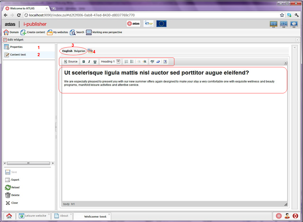
Simple widget – the text
In the picture below you can see the editor of the text widget. The “Content text” tab (2) is opened but you can see the shortcut for the “Properties” tab (1). The content of each text widget is a text (valid HTML) in all website languages. Fill the text you want to be placed in your page in the default website language. There is a simple toolbar to help you style your text. The languages toolbar (3) contains all website languages. The button for automatic translation (4) translates the text from the default language to the selected one using the automatic translation service.
-
List widget
The list widget is one of the few widgets designed to display dynamic content (the other one is the details). It is the most complex widget with lots of configurations to be made.
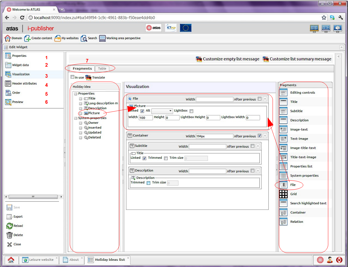
In the picture below you can see how the list widget's editor looks like. There are five configuration tabs and one action.
-
“Properties” tab – configure the general properties of a widget;
-
“Widget data” - select what data (from which content types) will be displayed and how it would be filtered;
-
“Visualization” - define how each content item will be displayed;
-
“Header attributes” - translate the labels of the header attributes (filter parameters);
-
“Order” - define how the listed content items will be ordered;
-
“Preview” - make a preview of the list. It may look different from what you see in the page since the page may apply some additional styles to the list. Some dummy content would be created, if necessary, for preview purposes only.
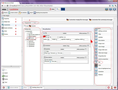
In the picture above you can see the “Visualization” tab of the list widget editor. To the right are listed all available fragments. To the left there is a list with all selected content types (in our case just one) with all their properties, including some system ones. Each content type is presented in different tab. You have to define visualization for each selected content type.
You can display the list as a table as well. From the mode tabs (7) you can define the table visualization of the list.
-
ATLAS (Applied Technology for Language-Aided CMS) is a project funded by the European Commission under the CIP ICT Policy Support Programme.